
The Infographic DataSheet provides a visual representation of some of the most common considerations when looking at a chart. It can be a great way for students and practitioners to get a high-level sense of a chart quickly.

Select this icon from the toolbar to view the Infographic DataSheet for the current chart.
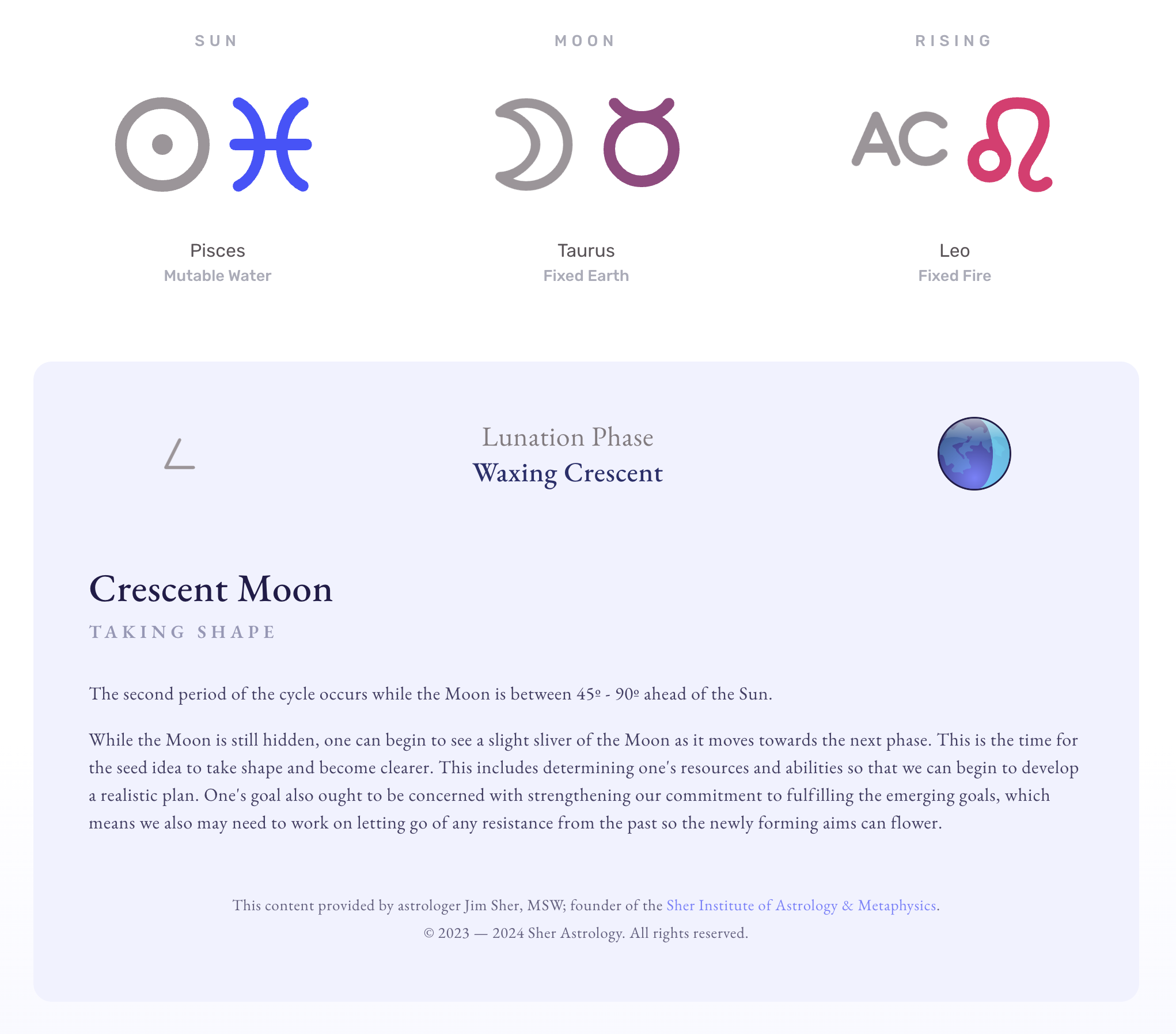
Trinity & Lunation
The top portion of the Infographic DataSheet shows the Sun, Moon and Ascendant of the chart in easy to read iconography. This is great for students who don’t necessarily know the symbols or angles just yet.
Below that is the Lunar phase based on an eight (8) fold division of the Sun-Moon cycle.
Zodiac Attributes
This section analyzes the quality and elemental distribution of each point in the chart based on your settings.
The graphics provide a color and size coded visualization of how each of these factors is represented in the chart, without having to count up each chart point manually.
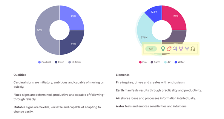
In pie or donut charts like these, you can hover over each of their wedges (tap on mobile) to see the underlying data that is used to calculate each one.
Aspect Distribution
The concept of this graph is to try to show an accurate summary of all aspects in a chart without having to parse through each one in the Aspects DataSheet.
X-Axis
Along the horizontal x-axis there are numbers ranging from 0 — 180. These values represent all possible aspects that can exist in a chart. Even though there are waxing and waning versions of each aspect, they are “mirrors” of each other in that the arc of separation is the same for each pair. Thus the waxing trine and the waning trine are both represented by the angular value of 120º.
Y-Axis
Along the vertical y-axis there are numbers starting from 0 and increasing variably based on the number of total aspects found. These values represent the count of a particular type of aspect.
Bubbles
Plotted on the graph are bubbles of various sizes, each having the name of the aspect they represent overlaid on them. Larger bubbles indicate the aspect of that particular type has a larger impact than a bubble of a smaller size.
The overall impact of a type of aspect is determined by:
- Counting the number of times that type of aspect appears in the chart.
- Counting the number of times the Sun or Moon are involved in that type of aspect.
- Counting the number of times one of the angles is involved in that type of aspect.
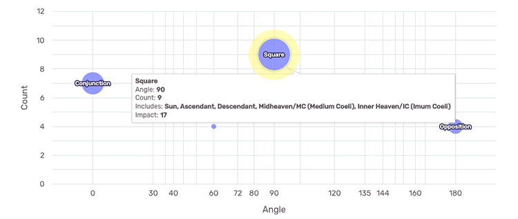
In this example, we can see that squares are very significant in this chart because not only are there 9 of them, but one Luminary (the Sun) and all four (4) angles are involved, even more than once.
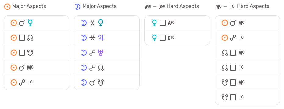
Aspect Summary
Below the Aspect Distribution graph are four (4) tables of potentially significant aspects. Many astrologers consider major aspects involving the Luminaries to be significant. Additionally, oftentimes hard aspects to any of the four (4) angles are also considered highly significant. These tables provide another way to quickly glance at visual data to see what might be happening in a chart.
Declination Map
This graph provides a unique view of the entire chart from the perspective of declinations. Additionally, the Declination Map can be used to easily look for parallel and contra-parallel declinations between any two (2) chart points.
X-Axis
Along the horizontal x-axis are numbers ranging from 0 — 360 (the number 360 doesn’t display, but the graph does extend to this value). These values represent the ecliptic longitude coordinate of each point in the chart. This means 0 is equivalent to 0º Aries, while 180 is 0º Libra, etc.
Y-Axis
Along the vertical y-axis is a spread of numbers ranging from -30 to +30, with 0 in the middle. (The graph extends to +/-30 although the numbers don’t actually show at the extreme min/max positions.) These values represent the equatorial declination coordinate of each point in the chart.
Out of Bounds (OOB)
The horizontal lines near the numbers +/-25 on the graph represent the OOB value of +/-23º 26′ 24″ respectively.
Chart Point Dots
Each dot on the graph represents a point such as a planet, node or angle from the chart. You can hover over each one to see the zodiacal longitude position and its exact equatorial declination value.
Mapping Declinations
An interesting feature of the Declination Map is that you have the ability to interact with it:
- Select one of the chart point dots by clicking it with your mouse or tapping it if you’re on mobile.
- You will notice the chart point’s name and declination value appear above the Declination Map.
- Select another chart point dot and its name and declination value will appear next to the first one.
- Review the numbers to determine if these points are in parallel (within 1-2º of exact) or contra-parallel (within 1-2º of exact of their absolute values).
- Select the “Clear” button to remove the chart points from the top of the graph and start again.
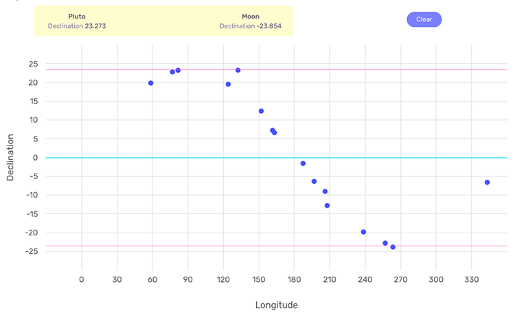
In this example, we can see that the Moon and Pluto are in a contra-parallel declination.
Hemisphere Emphasis
Some astrologers use hemisphere and quadrant emphasis when analyzing charts. LUNA provides three (3) pie charts that work similarly to the Zodiac Attributes donut charts.
Each hemisphere is labeled and displays a number next to its name. This number represents the count of chart points found in that particular hemisphere.
The quadrant pie chart only displays numbers representing the count of chart points in each one.
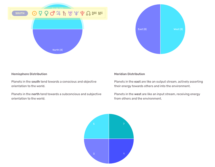
Like all charts on the Infographic page, you can hover over or tap on the hemisphere/quadrant pie charts to see the underlying data for them.